Enhancing the member experience at Sam’s Club Tire and Battery Center

My Role
User Design
User Research
Stakeholder Collaboration
The Team
4 UX Designers
Project Type
Industry Sponsored
Timeline
15 weeks
Software
Figma
This is a high-level overview of my UX research and design work with my team. To protect any private data, specific details are omitted or obfuscated. Please contact me to access full case study.
The Starting Point
Sam’s Club is a wholesale, retail chain and subsidiary of Walmart, with over 47 million members and 600 locations across the United States and Puerto Rico.
My team needed to examine the member and associate journey to identify areas we could improve the current experience at the Tire and Battery Center.
The Tire and Battery Center is a service garage that offers members a wide range of services for their vehicles including tire rotations, tire sales, and battery products.
Scoping the Problem and Our Users
I was thrilled to have the opportunity to take on a broad, yet challenging design prompt. My teammates and I were eager to go in like super designers and improve as much as we could. However, by attempting to look at every cornerstone of the member journey at the Tire and Battery Center, the problem rapidly became overwhelming. With a limited timeline, we set high-level goals on how we would approach the problem:
How do members learn and discover what services are available to them?
How informed are members about their vehicle service details?
How do members feel about the overall vehicle service experience?
Our target auto users were Sam’s Club members who own and operate a vehicle. And members who were new or existing customers of the Tire and Battery Center.
With that, we were then able to devise our problem statement.
Problem Statement
How might we enhance member-associate interactions and communications within the Tire and Battery Center to create a more efficient, informative, and enjoyable experience for members?
Introducing our mobile app for the Tire and Battery Center
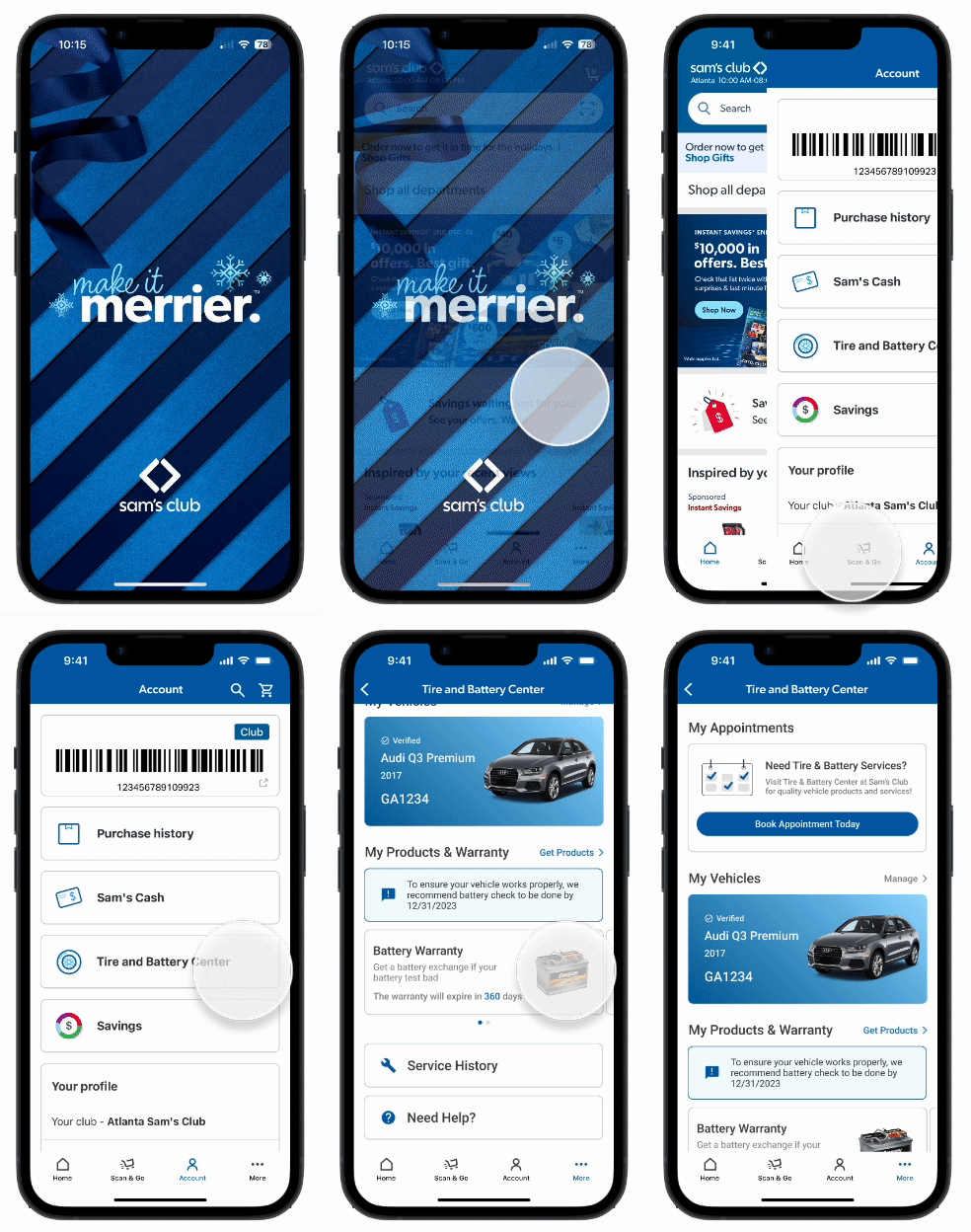
We designed an iOs mobile app solution to provide an all-in-one, seamless solution for members with the convenience of their phone.
Our proposed design solution would integrate the Tire and Battery Center within Sam’s Club pre-existing mobile app. And members would have the ability to manage their vehicle information, book and checkin for appointments, and receive updates on their service all from the mobile app.
“I’d love a way to make my own appointments online.”
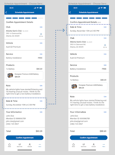
Convenient Online Booking System - manage appointment scheduling at home
Members can book appointments online and select their preferred Sam’s Club location, their vehicle, type of service(s), date, time, and add personalized notes for the technician in preparation for their appointment.
“It’d be nice if I could check-in fast without repeating all my vehicle info.”
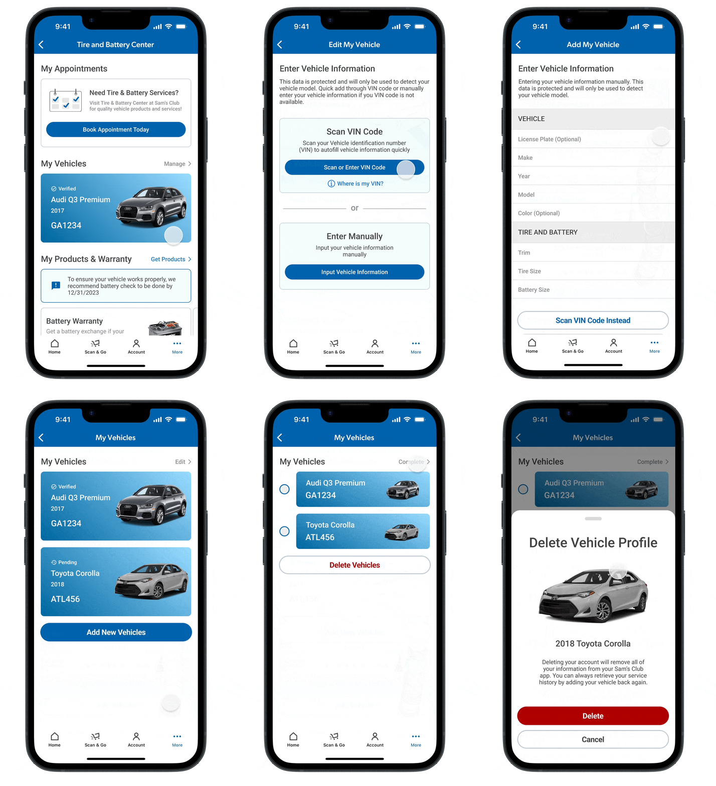
Add & Manage Vehicles - reduce repetitive paperwork
Members can add and save vehicles to their account and view the vehicles profiles. They can also edit and delete vehicle details.
For convenience, members can add vehicles by scanning their Vehicle Identification Number (VIN) with their phone camera or manually entering the details. Once the vehicle is added, the status will be pending approval for an associate to confirm details are correct.
“I’m usually in a hurry so a short wait time when I come in for service is always fantastic.”
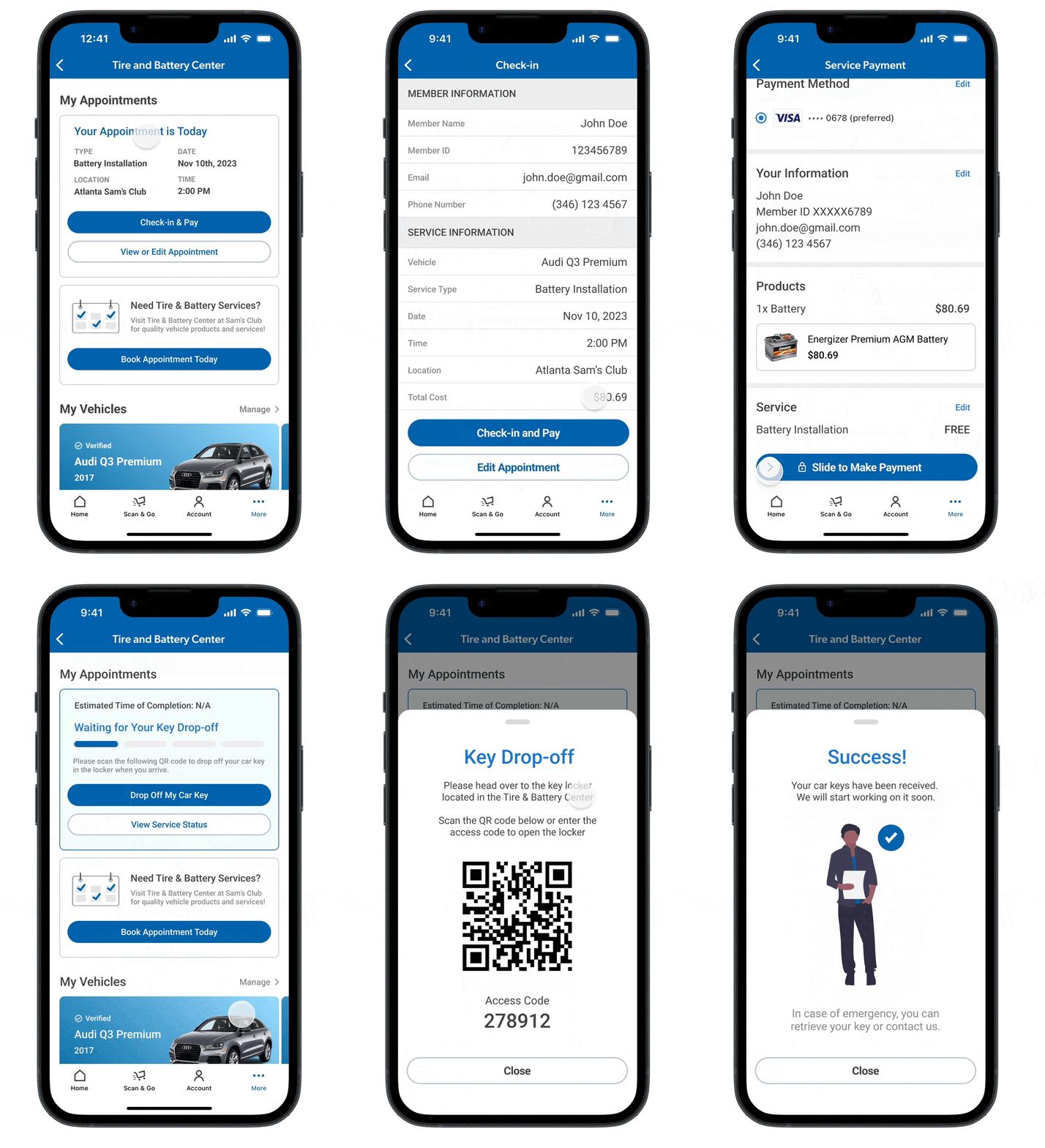
Checkin & Key Drop-Off - reduce wait-time at the front desk
Once members arrive at the club for their appointment, they can checkin via the mobile app (~2 hours prior to their appointment time).
Once members are ready to checkin, they have the option to pay from the mobile app. Upon payment confirmation, the members receive a QR Code to access and drop-off their keys in lockers at the Tire and Battery Center.
“Papers are tough to keep track of in general… So it’s hard to save all of my paperwork and receipts from my services.”
View Service History - reduce paper trails of service history
Members can access and browse their vehicle service history information through the mobile app. This lets members conveniently find details about their service at anytime.
They can search and filter their service history by vehicle, type of service, date, and club location.
“I like it when you take out a lot of the guesswork… I can just wait for an update and everything is taken care of.”
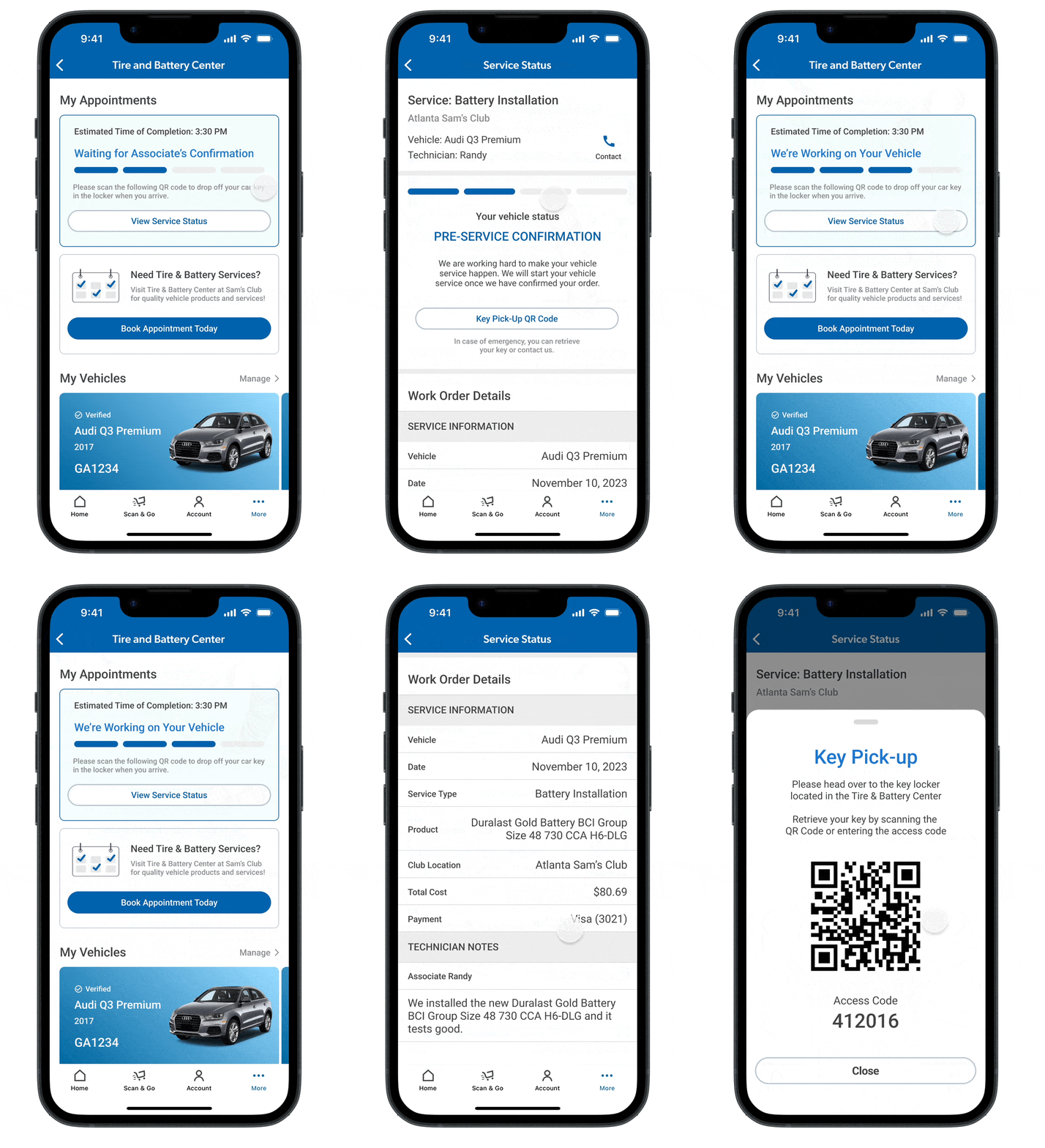
Real-time Service Updates - keep members in the know about their vehicle service progress
Members can view the current status of their vehicle work order and receive real-time updates and notifications throughout the process.
Members can view details about their service including estimated time of completion and technician notes.
Rewinding Back in Time
A tour through our design process and how we got to our solution.
Getting Scrappy and Starting from Scratch
With little domain knowledge about the ins and outs of auto service garages (I know where my gas pump is and how to start the ignition), my team spent the first two weeks ramping up our domain knowledge of the industry and how Sam's Club's Tire and Battery Center service operations worked.
Our Approach & Timeline
-
Discover
(September - Early October)
Field Observations
Contextual Inquiry
Competitive Analysis
Interviews
-
Define
(Mid - End October)
Affinity Mapping
User Journey
Personas
-

Develop
(November)
Ideation & Brainstorming
Sketching & Wireframing
User Feedback Sessions
Rapid Prototyping
-

Deliver
(December)
Usability Testing
Heuristic Evaluations
Iterate & Refine
Presentation to Stakeholders & Peers
Inside the Garage and at the Front Desk
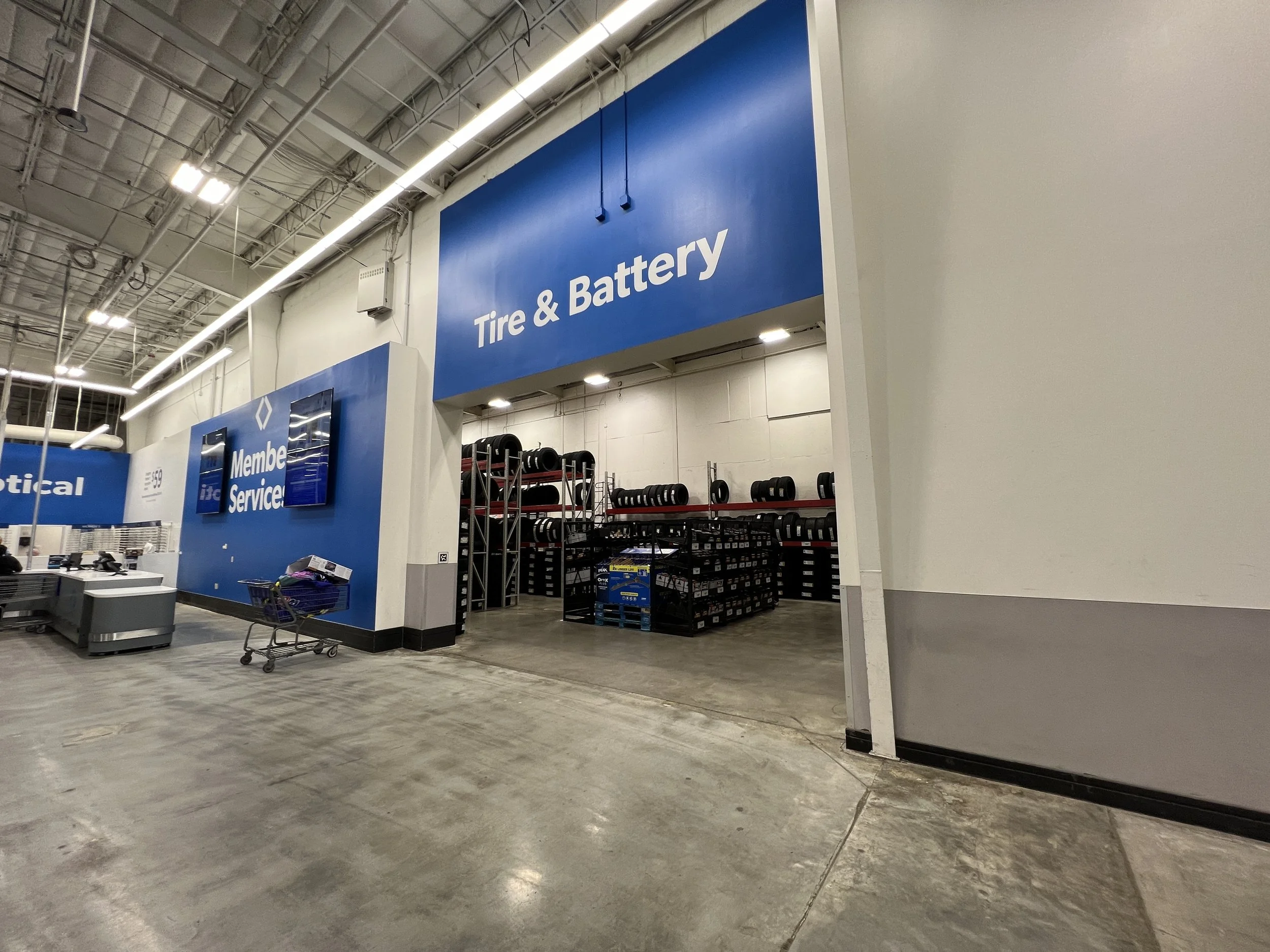
We made Field Observations and visited Sam’s Club locations across the Atlanta area. We also conducted a Contextual Inquiry to understand what it’s like to be in the shoes of an associate in real-time.
Key Insight
My team could target streamlining the front desk checkin process to alleviate customer traffic.
Competitive Analysis
To identify gaps and opportunities, we took a look, both in-store and online, at some of Sam’s Club Tire and Battery Center’s biggest competitors in the industry. Below I’ve highlighted our insights based on our analysis.
Walmart
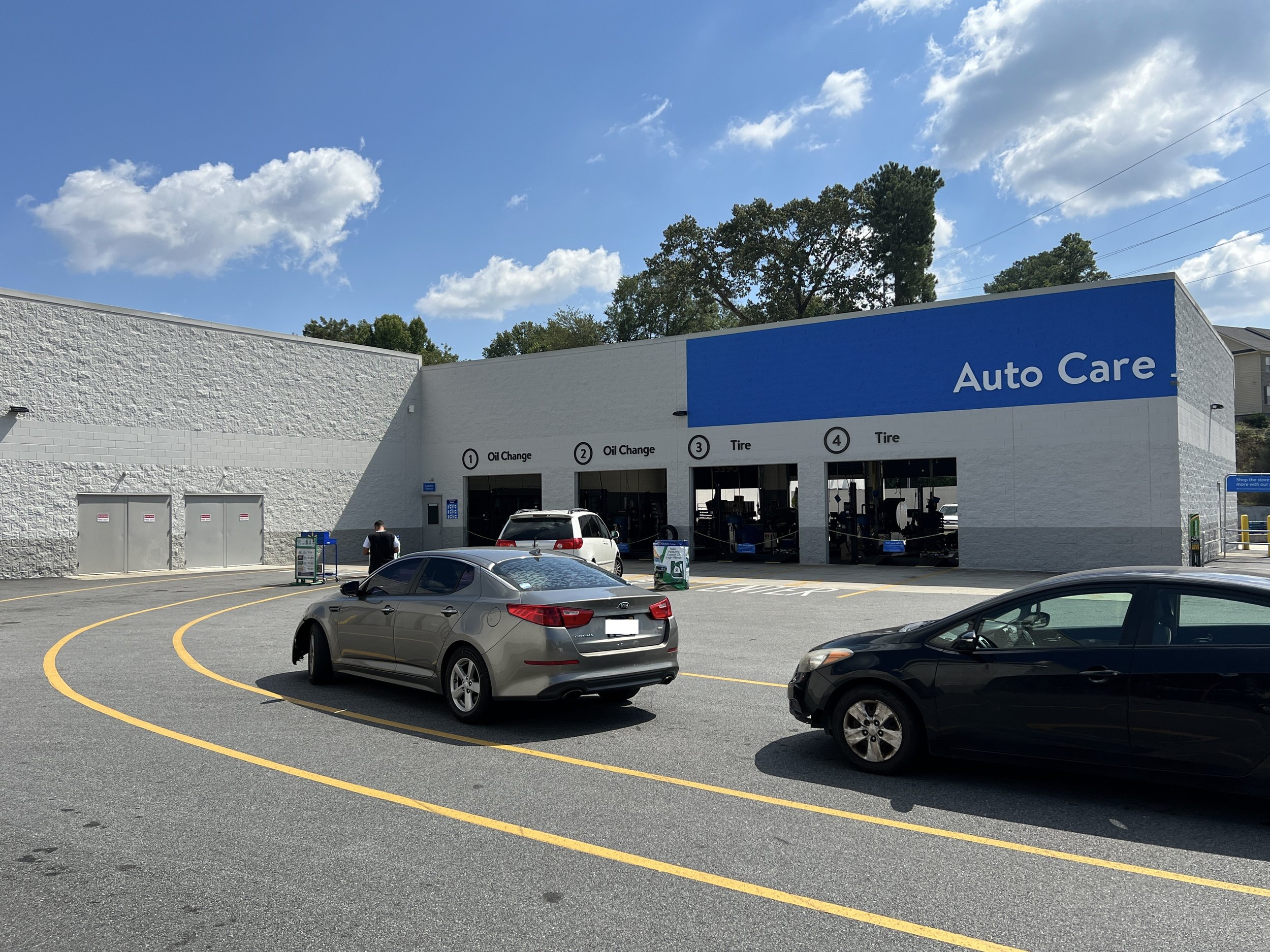
Walmart has clear signage and wayfinding in its parking lot to help customers navigate where to go and in-store services.
Costco
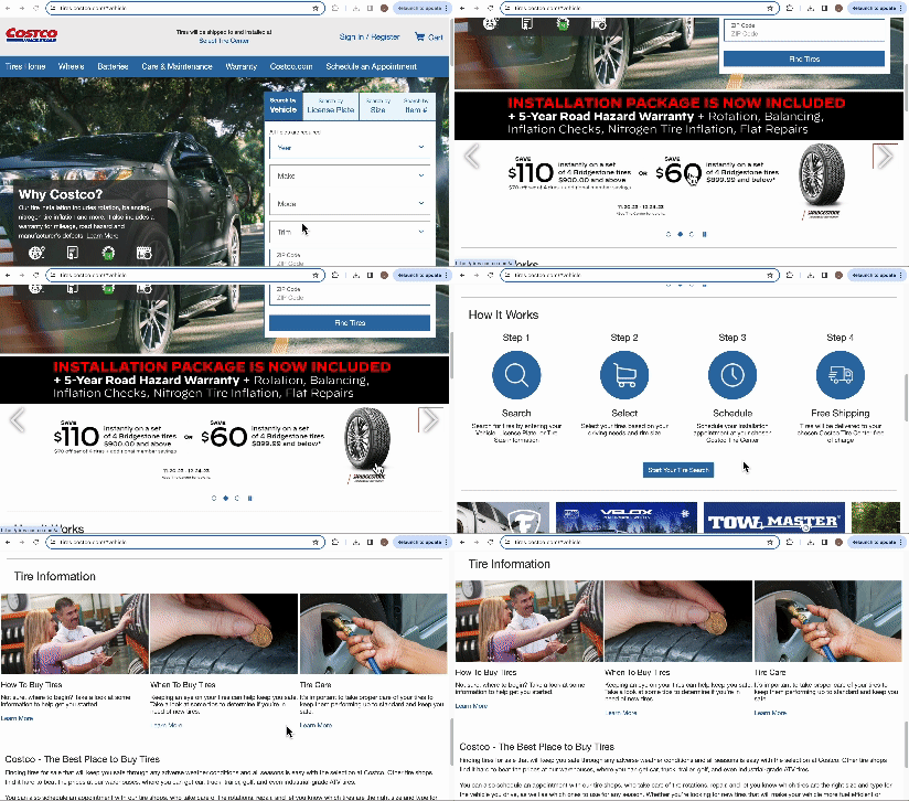
Costco has informative and educational content for its customers online. Their website provides step-by-step walkthroughs of how to book an appointment to how to care for your tires.
Discount Tire
Discount Tire has a convenient online booking system with a progress by and step-by-step explanations of each requirement in the process.
Key Insight
Competitors offer convenient online booking along with intuitive wayfinding and auto-education both in-store and online.
A Member’s Perspective
We held Semi-Structured Interviews with Sam’s Club members who had experience using the Tire and Battery Center. Our goal here was to understand what their experiences and pain points they faced during their vehicle service process.
I wrote and structured our user interviews and focused on the following key areas to uncover our insights of interest:
Technical Auto Knowledge
Wayfinding & Accessibility (both in-store and online)
Vehicle Service Understanding & Awareness
Suggestions for Improvement
We also used Affinity Diagramming to synthesize our data and uncover insights about our users. We created Design Implications based on our user needs and illustrated these ideas with Personas and User Journey Maps. We were then able to create our goal for the project.
Actionable Design Recommendation
Our goal was to create a solution that would provide speedy service and eliminate guesswork about the service process.
Ideating, Prototyping, and User Feedback
To begin ideating design ideas, we used Affinity Diagramming, Moodboards, and various brainstorming techniques like Rapid Ideation to narrow our ideas to 5 design solutions within 2 categories. We then created Wireframes to test out our design ideas.
In-Store Interactivity
Interactive Kiosk
Automatic Drop-Off Lockers accessed with a QR Code
Mobile App
Educational Auto Content and Personalized Promotions
Vehicle Information Management
Service Reminders and Follow-up Notifications
Missing the Mark and Switching Gears
The feedback we received insights from our feedback sessions, in particular the following:
Make Information Bite-Sized and Easy to Skim
Much of our UX copy was too lengthy and needed to be more concise and action-oriented.
Keep the Focus on Vehicle Service Management
Rather than having supplementary articles on automotive needs, users wanted more focus on being able to manage and easily access their vehicle service information.
Design an All-in-One Solution
Users felt that having all functionality in one place was more convenient and intuitive. Additionally, users felt happy about being able to access all the information from their mobile phones.
Key Insight
Users wanted an all-in-one, comprehensive solution to manage their vehicle service needs.
Moving Forward to Our Design Solution
Based on user feedback, we decided to move forward with an iOS mobile app solution that would include comprehensive features to address the users needs.
We captured screenshots and referenced Sam’s Club’s website and iOS mobile app to develop a visual design language. We also made decisions on how to keep the look modern (e.g. using pill shaped buttons, etc.) while staying consistent with Sam’s Club’s branding.
Heuristic Evaluations & Usability Testing
We conducted Heuristic Evaluations based on Jakob Nielsen’s 10 Usability Heuristics with UX professionals.
Next, we conducted Usability Testing with potential users who had prior experience using automative services like Sam’s Club Tire and Battery Center.
Re-structuring the Information Architecture
Based on user feedback about what information is most important to them, we restructured the information architecture in our mobile app to reflect what users valued most.
More Clarity and Intention with UX Writing
Users found some of the UX writing confusing within the app and expressed wanting more succinct and clear information about what the texts, links, and buttons purpose was. We re-wrote several of our UX copy to add more clarity.
Incorporate Stylistic Variations to Increase Visual Interest and Clarity
Users found some of the blue headings confusing to distinguish between links or non-interactive text. Additionally, users wanted to see more visual interests and variations in imagery and style to make the buttons pop. We included different imagery and edited the visual hierarchy to address this.
The Design Solution
Interact with our prototype on Figma
Reflecting on the Journey
Meet me and the team!
Scope the Problem Early… and Scope Again
One of my biggest takeaways would be to scope the problem early. I would have loved to dive deep into developing one important feature.
Recruit more Users for Testing
If I could go back in time, I would hustle more on finding more users to get more feedback and generating more iterations to improve our design.
Try More Evaluation Techniques
If I were to continue on with the project, it would have been interesting to try out more evaluation techniques for our prototype, e.g. testing for desirability.
Attribution: Icons used in this case study were sourced from Freepik’s Special Lineal Collection.

